


“Jesus in the Neighborhood” stories – Video curriculum – Immigrant resources – Conscientious objection
Welcome to the Church of the Brethren
“Together, as the Church of the Brethren, we will passionately live and share the radical transformation and holistic peace of Jesus Christ through relationship-based neighborhood engagement. To move us forward, we will develop a culture of calling and equipping disciples who are innovative, adaptable, and fearless.” More on the Compelling Vision – Visión conjunta y motivadora – Vizyon Konvenkan
Use the menus above to explore our identity and ministries—or sign up to hear from us via email. We have around 800 congregations across the United States, with sister churches in many countries.
Based in the Anabaptist and Pietist faith traditions, the Church of the Brethren is a Historic Peace Church. We celebrated the 300th anniversary of the first baptism on this continent in 2023.
The Church of the Brethren is not affiliated with the Plymouth Brethren Christian Church (Exclusive Brethren).
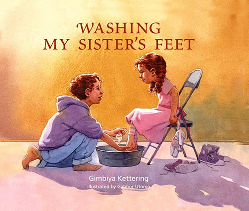
A new children’s book from Brethren Press. Pre-order now or find at Annual Conference; there will be a book signing Sunday, June 28, 8:30-9:30 p.m.

Annual Conference
June 28–July2
Fort Wayne, Indiana
Advanced Registration has closed for onsite participants. Virtual Non-Delegates can still register through June 23.
Learn about a special opportunity to preserve the history of the Church of the Brethren in America.


Humans and intelligence
"In conversations about artificial intelligence, I like to lean into my Brethren identity."

Amos: Called by God
Amos didn't have an easy message, but he took his call from God seriously and preached with courage, power, and strength.
Best of The Church Press 2025
The Church of the Brethren won six awards in the Associated Church Press 2025 "Best of the Church Press" contest.

Fast typing
Manual typewriters to modern laptops: hardworking keys are a medium through which the words are launched into publication.
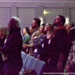
Fellowship through worship
How do we build community together?